Dear friends, when we last convened, you were kind enough to read “Baltimore Clayworks offers a dazzling variety of work in Keystone Clay: West exhibition- My review and "digging deeper" into the work of Andrew Castaneda.”
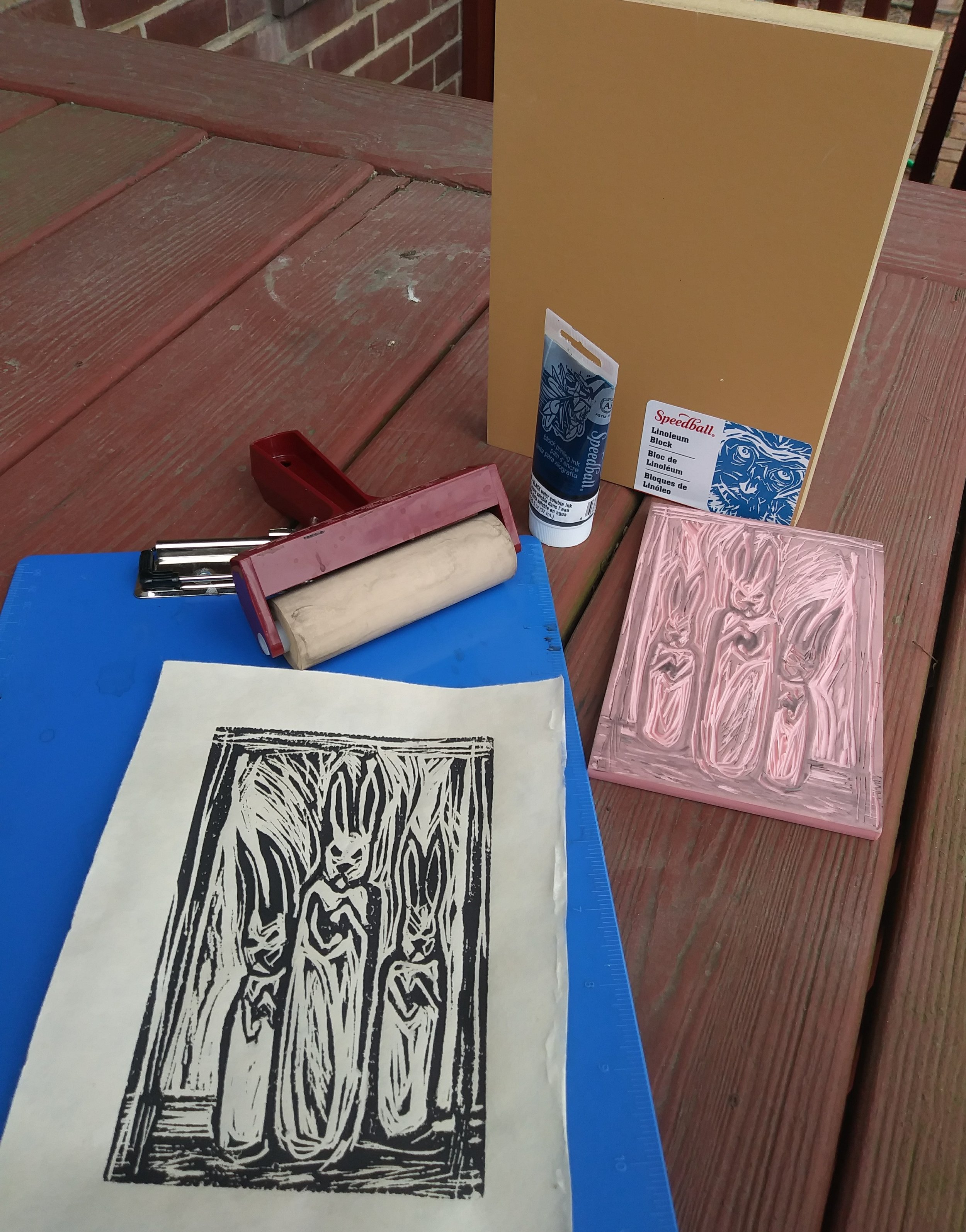
This week, in order to fulfill the plan I set out for myself in the beginning of the year, I created a linocut print with my new Speedball Super Value Block Printing Starter Kit.
I wanted to explore the idea of the votive rabbits a bit more, but in a new way- one that, frankly, was less time consuming than making sculptures, but which still allowed me to (literally) dig into the material. (Click here to read more about my votive rabbits) It is this tactile quality, abundant in forms of printmaking like woodcut, or linocut, that I find particularly appealing.
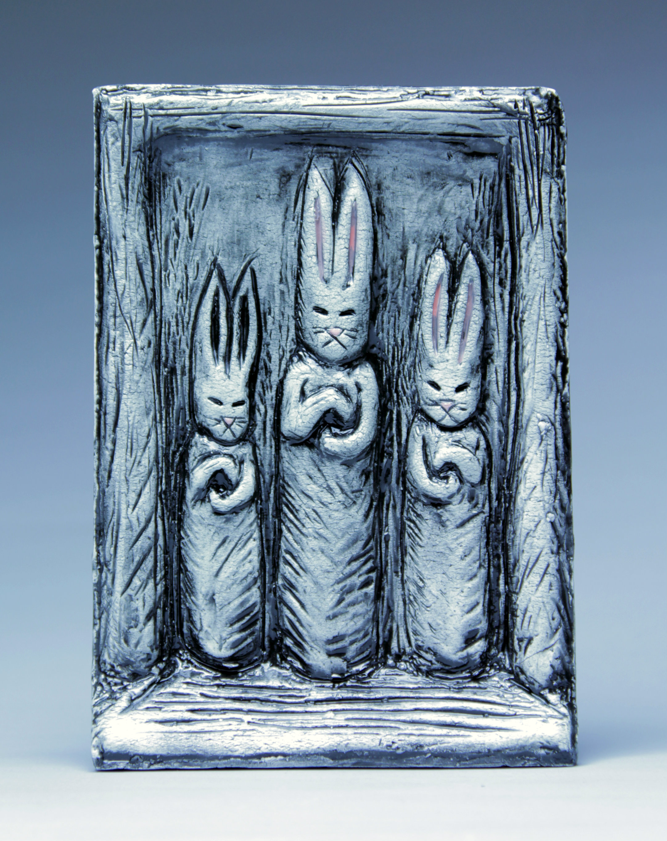
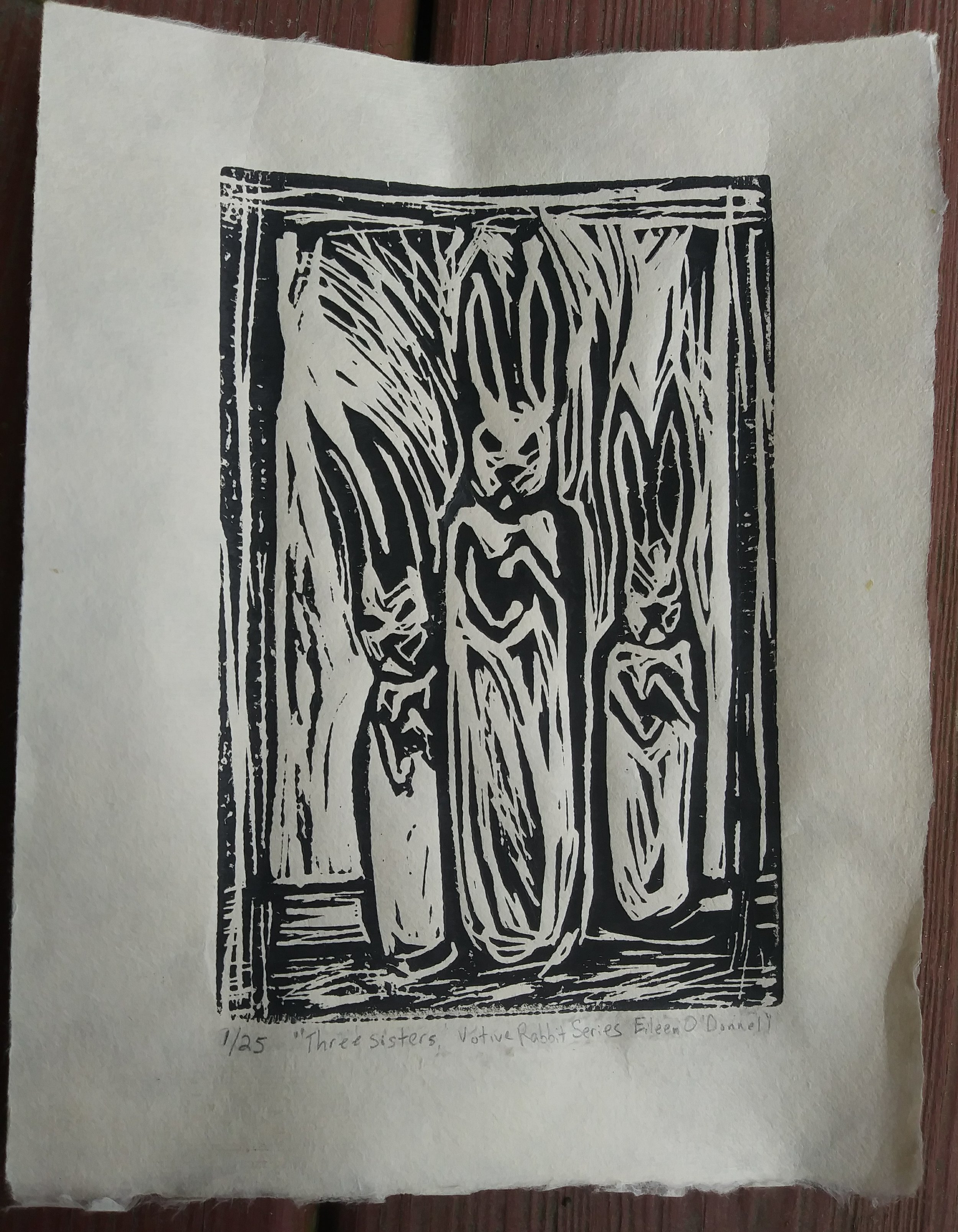
“The Three Sisters” Clay, Glaze- another iteration of my votive rabbit series. This is a roughly 6 in. x 8 in. ceramic tile that can hang on the wall. I made a mold of my original, then created a few more- including a few that have backs so they can stand alone on a shelf or desk top.
Many famous sculptors have incorporated printmaking as part of their art practice: Picasso, Louise Bourgeois, Giacometti, Leonard Baskin, just to name a few. In addition to being a lot of fun, making prints has always been a way for artists to provide a less expensive, yet still handmade, piece of an artist's work. Also refreshing is the short turn-around time between carving a block, and creating a finished piece of art. While sculptures can easily demand months before they are finished, some prints can be created and executed within a day. Perhaps this immediacy is another reason why printmaking has been particularly appealing to sculptors.

More versions of my votive rabbits. “The Wedding Party” These are freestanding clay sculptures that also function as incense burners.
Before getting started on my own design, I thought it would be a good idea to revisit the work of some of my favorite printmakers. Gathering inspiration is the first step in my creative process. While I knew that my print would be an image of one or more of my votive rabbit figures, I wasn’t quite sure how I would compose the figures within the space, or “frame” of the block. I also wanted to look at examples of the types of line and textures great printmakers create to define areas of light and dark.
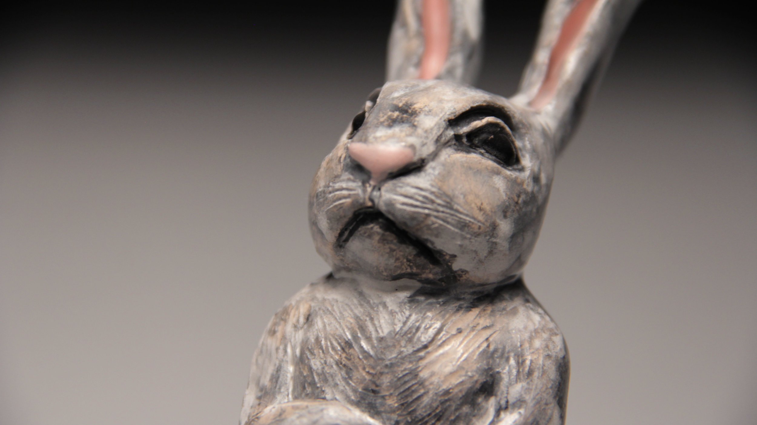
Detail, “The Wedding Party”
Step 1: Gather inspiration
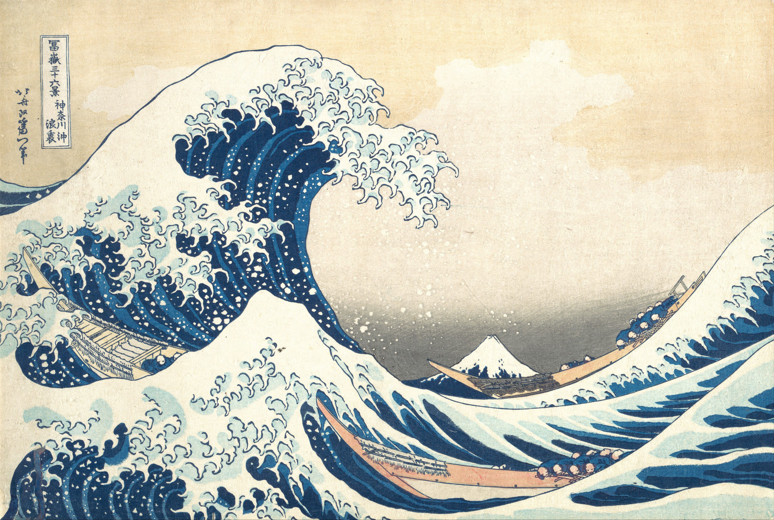
The works of Kathe Kollwitz are masterful examples of composition, and of using light to define a form. In her powerful woodcuts, Kollwitz places her figures within the frame for maximum emotional impact. She is acutely aware of the path the viewer’s eye will take, and has even manipulated the space around the figures in such a way as to express their innermost being.
In “Hunger,“ the gaunt figures seem to have just passed through a brief moment of light from within a swallowing dark- we have this one chance to witness their horror before they disappear again into nothingness.

“Hunger” by Kathe Kollwitz, woodcut
In “Frontal Self Portrait “ we see an entirely different use of the figure in space. Here, Kollwitz has placed the face so large within the frame as to make it monumental. The effect is of a serene confidence- placid but unmoving- a woman who has navigated the shoals of life, and through their lessons has become a rock herself. (For an interesting sculptural reference, See Olmec colossal head)
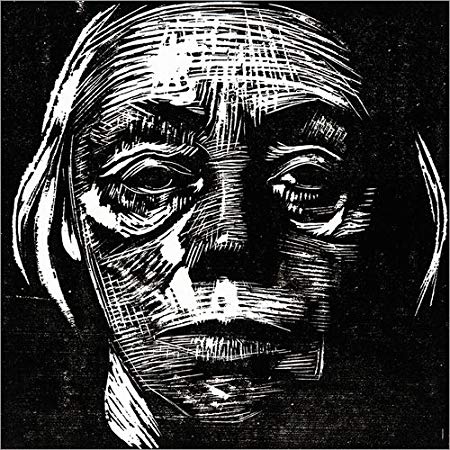
“Frontal Self Portrait” by Kathe Kollwitz, woodcut
Kollwitz portrays the quality of light in both of these prints in different ways as well. In “Hunger,” she draws the effect of a single, but powerful, overhead light onto the figure of the little girl. The form of the little girl is broken down into the most extreme abstract shapes of light and dark, emphasizing the desperation in her eyes, and this precarious moment in which she is suspended between life and death. The other figures are nearly disembodied by the blackness, rimmed by the light from a distant window. The hand that clutches the man’s throat could be his own, but could just as well be the hand of starvation, reaching up to collect him.
In “Frontal Self Portrait,” Kollwitz draws the effect of two diffused light sources, one overhead, and one to the viewer’s left, to show us, in great detail, her careworn face. The marks she created here to portray her face are more subtle and nuanced than in “Hunger.“ These marks overlap and create many layers of texture, appropriate for describing the many years that have been written upon her face.
Lastly, I really appreciated Kollwitz’s ability to break down light and dark into rather sculptural shapes, as well as the way she distorted traditional proportions of her figures for emotional impact.
Stage 2
Sketching my design

My initial sketch of “The Three Sisters” I changed the design a bit because I wanted the composition to be a bit more dynamic. In the initial sketch, all three figures are front and center in the frame, and create a stable (triangular) composition.
While I am no Kathe Kollwitz, I can still aspire to utilize some of her techniques in my own work. For my linocut, I wanted an image with three votive rabbits within the space of the frame. I’ve drawn my votive rabbits many times onto clay tiles, but all have been much larger than the 4 inch by 6 inch block included in the kit. Another important consideration in sketching my design is the fact that all of the marks I make onto the block will appear white. My votive rabbit figures rely on a rather simple gestural outline- that means I have to cut around everything else other than the (rather thin!) lines that describe the figure.
Stage 3
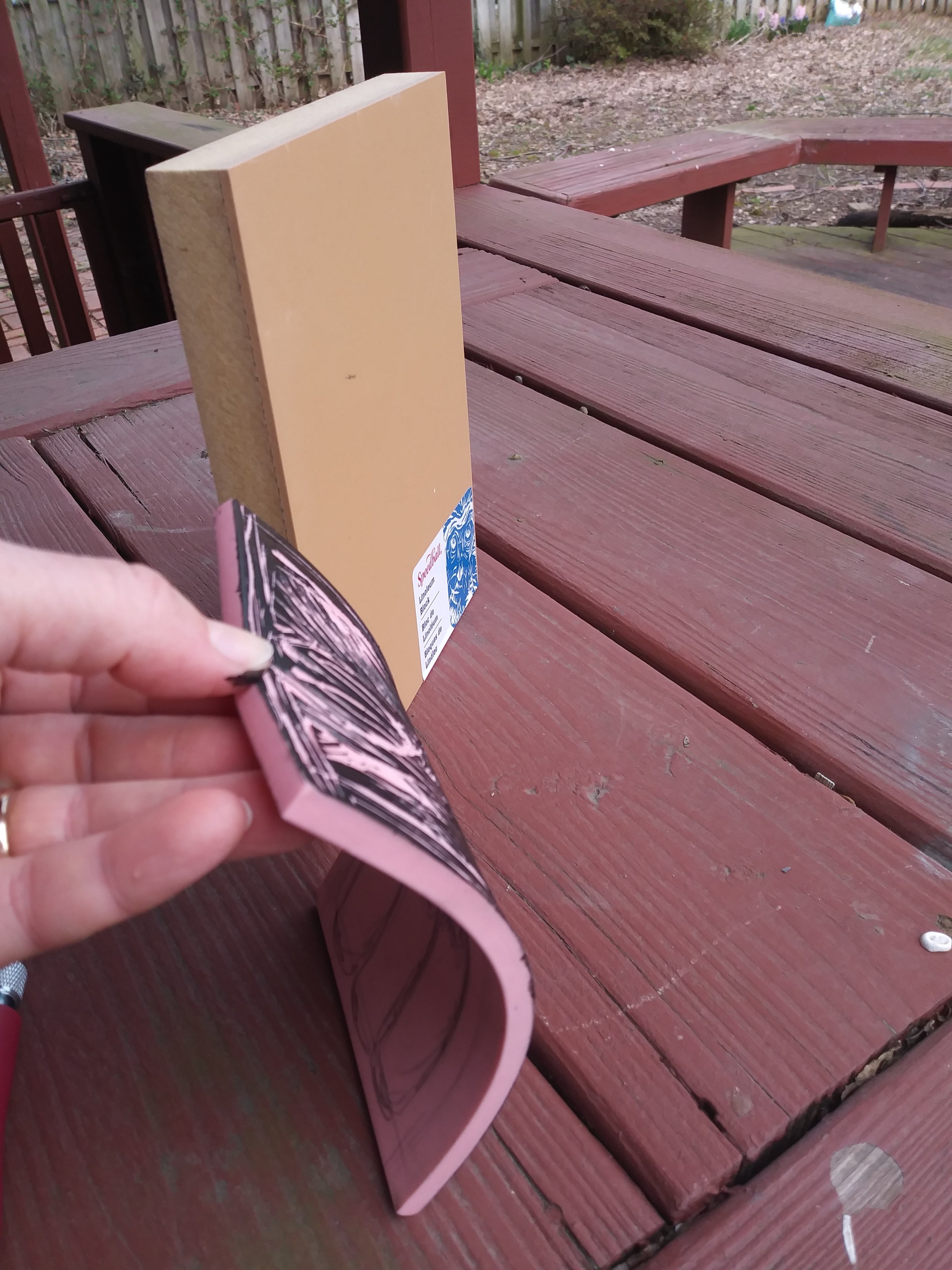
Carving
While I was familiar with how to create a linoleum cut from my school days, the kit came with a new kind of carving block that I had never used before. The 4 x 6 “speedy carve” block was pink and floppy, and felt like a pencil eraser. Would it be better than the old style block? The Speedball Starter Kit also came with a linoleum cutter with three interchangeable cutting tips. The tips are made of metal, and have a “v” shape. The widest “v” tip can carve out large swathes of linoleum. There is a more narrow “medium” sized cutting tip, and lastly, the small, the most shallow and narrow of the three.
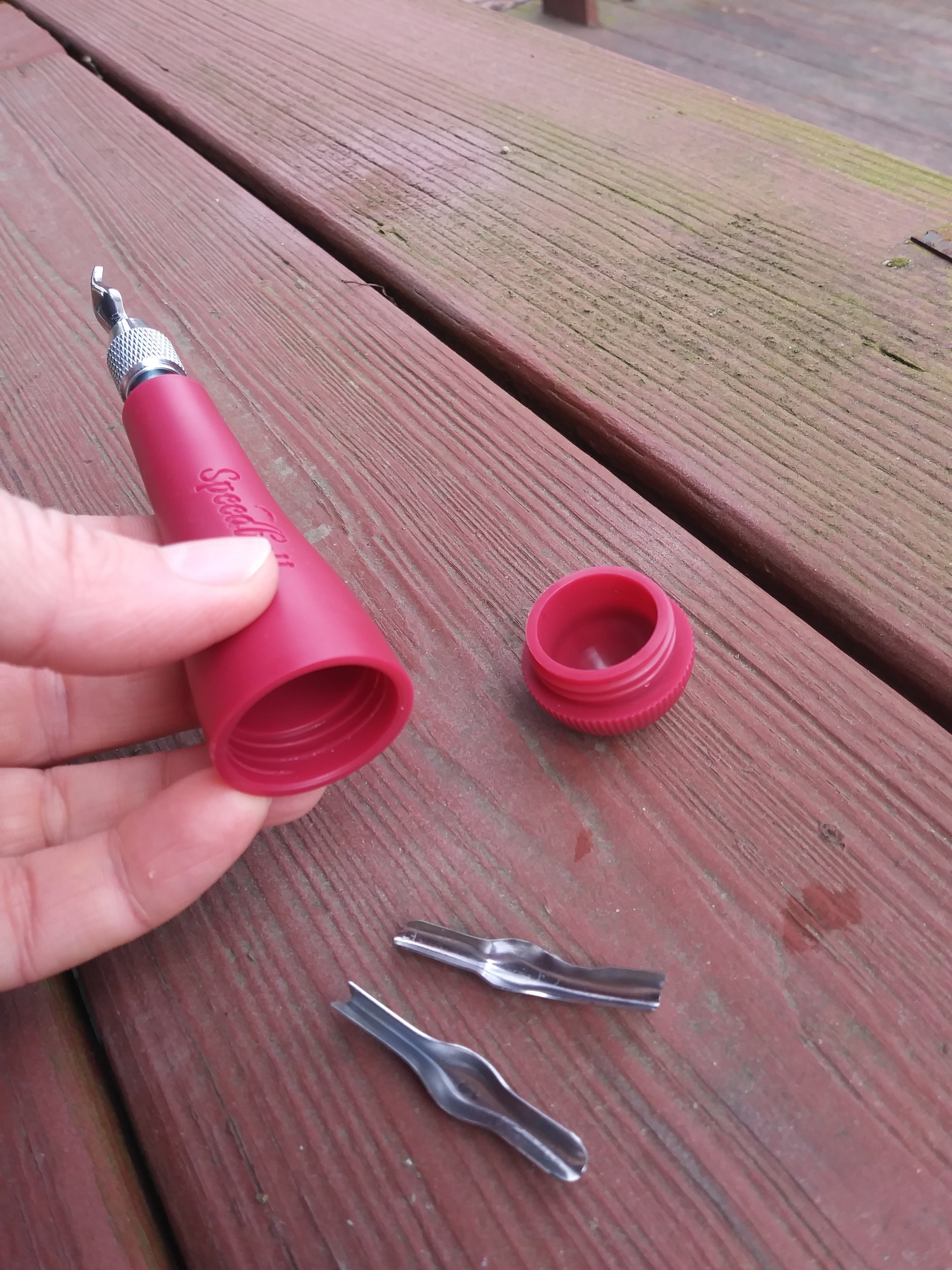
The Speedball lino cutter. The bottom of the handle serves as a handy carrying case for the cutting bits. I did not know this, (there were no directions in the box), and I almost went back to the store before I realized that I could unscrew the bottom of the handle!
I used the back of the “speedy carve” block for a test carve. The cutter ran through the block like butter. It was amazing how smooth and easy it was- not at all like the exercise in blood letting that cutting through the old linoleum blocks were!
Step 3
Preparing the paper to print
I’d purchased a lovely sheet of traditional printmaking paper from the art store. It had a creamy, beige color, a soft texture, and the edges were beautifully frayed. It only came in a large size, roughly 24” x 36,” so I knew I would have to re-cut the piece so that my 4 in. x 6 in. print would have an appropriate border. If I were doing a very complex print, I would have either selected, or made, a piece of paper that would offer the right sized border for my print. “Cutting” a piece of handmade paper doesn’t involve scissors. In order to approximate the look of the frayed edges on one side of the sheet, I used a ruler to tear the sheet into smaller pieces. I then rubbed my fingers along the edges I had torn to fray them a bit more, so that they would match the frayed edge from the original sheet.
Step 4
Inking
The kit came with a small tube of water based black ink, and a brayer. The brayer looks like a small rolling pin attached to a handle, but it is an important tool in making a successful print. It helps to spread the ink out evenly over the surface of the block, so that there will be no blobs of ink that will sink into the carved areas. This is important since these carved areas will appear white, or the color of your paper. Too much ink here could potentially bleed into the recessed areas of your block, and ruin your design.
The kit did not have an ink plate- (just a plate that you can spread the ink out upon), so I used an old plastic clipboard. I spread a bead of ink on the clipboard, then rolled the brayer back and forth over it until there was ink all over the brayer. I knew I had loaded enough ink onto the brayer when it made a tacky sound- (see vid!) and the ink formed tiny ridges on the plate.
Then I rolled the brayer onto the surface of the block, several times, in both vertical and horizontal directions. When it seemed like there was an even layer of ink on the block, I placed the brayer back on the ink plate, and picked up my paper. Carefully, I positioned the paper over the block, and then gently rubbed the pad of my fingertip over the surface. (There is a tool called a burren that is traditionally used for smoothing the paper over the carving block, but I do not have one, and my fingertip would just have to suffice.) The goal here was to make sure that the paper came into contact with all of the surface areas of the block, and that there was a good transfer of ink to the paper.
Numbering and signing my print…
Step 5
Pulling the print- the Trial Proof, the Artist’s Proof
After smoothing my finger over all the areas of my design, I began to gently pull the paper off of the block, checking for any areas that did not pick up enough ink. I found a corner that I must not have pressed; the ink looked a bit lean and spotty where it should have been completely black. Because I hadn’t pulled the paper off all at once, I was able to roll the paper back down on the block, and press those areas again. After pressing again, I pulled the paper off and - success! There was a great transfer of ink to the paper. I set the newly made print aside to dry on my table.
This first print, or trial proof, is the first time an artist gets to see what the print really looks like. After inspecting their proof, sometimes artists will make adjustments to the design. After looking at my proof, I found that there was a small area near one of the rabbit’s ears that picked up a bit too much ink. I went back into the block with the smallest gauge cutter, and removed a bit more.
After a few more adjustments, I decided I was satisfied with the design. I then made an “artist’s proof.” The artist’s proof, usually labeled “AP,” is the standard by which all the other subsequent prints of that particular design are evaluated.
Step 6
Printing Multiples
Even though there is potential to do a large number of prints with this process, most fine artists make a limited number, usually under 100. After the 100th print is made, the block is “retired.” Some print studios will even strike the block, that is, to make a slash mark against the design, to prevent the block from being used again. While this may sound dramatic, there are several reasons for making these limited runs. One is to protect the quality of the artist’s work. Linoleum blocks, like other types of printing plates, will eventually start to wear down with use. This can affect the sharpness of the image, or the richness of the dark areas, and result in a print of inferior quality. Another is to protect the value of the prints themselves. While prints are often offered as an affordable option for collecting a piece of an artist’s work, making an unlimited number of prints would devalue their worth. I decided that I would do a “run” of 25 prints.
*Just a quick note about the “Speedy Carve” block. While the Speedy Carve block is super easy to use, it does have the downside of not being as durable as the traditional linoleum block, which is mounted on a thick piece of particle board. How many great prints can one make on the “Speedy Carve” block before the image starts to degrade? Not sure. But it seemed to work just fine for my small run.
The finished product
Step 7
Numbering and signing your print
Traditionally, prints are numbered and signed in pencil at the bottom of the image. Why pencil? I haven’t discovered any clear answer. However, some of my professors have said it is less distracting than an ink signature. Others do not sign their prints at all, but work their artist’s mark, or signature into the design of the print.
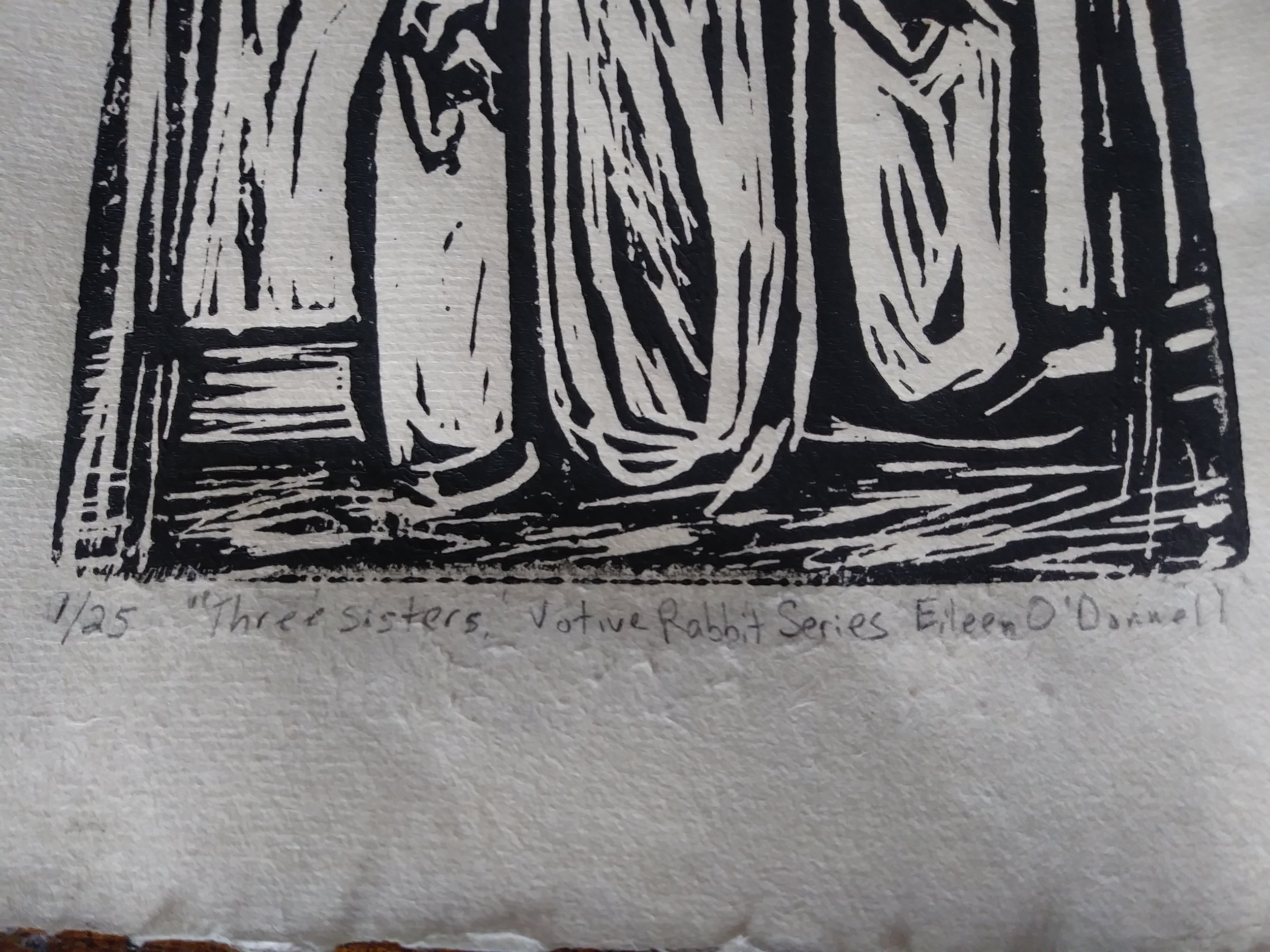
Since I am making a run of 25 prints, the first print after my artist’s proof is written as 1/25, the second is 2/25, etc. This is written just below the image, in the left hand corner. This lets the viewer know that this particular print is one of 25 made. I’ve written the title in the center, and signed my name on the right.
AND…
On to the next challenge!
I will probably do a few more linocuts in the coming weeks, but I wanted to mention that the linocut is just a small corner of the metropolis that is “Printmaking.” Etching, engraving, collograph, woodcut, lithography, screenprinting, aquatint… these are just a few categories of printmaking for you to discover! The techniques used can be as varied as the artists who use them, and the possibilities really are endless.